260 times more young people are dying from coronavirus vaccines than would have from coronavirus
Moderator: ofonorow
-
Saw
- Ascorbate Wizard

- Posts: 2012
- Joined: Wed Jun 02, 2010 2:07 pm
- Contact:
Re: 260 times more young people are dying from coronavirus vaccines than would have from coronavirus
Even a Blind Squirrel makes his own vitamin C.
-
ofonorow
- Ascorbate Wizard

- Posts: 16184
- Joined: Tue Nov 22, 2005 3:16 pm
- Location: Lisle, IL
- Contact:
Re: 260 times more young people are dying from coronavirus vaccines than would have from coronavirus
Owen R. Fonorow
HeartCURE.Info CARDIO-C.COM VITC-STORE.COM
LifeWave.COM/vitamincfoundation (Partner ID 2486278)
LifeWave.COM/inteligentVitaminC (Partner ID 2533974)
HeartCURE.Info CARDIO-C.COM VITC-STORE.COM
LifeWave.COM/vitamincfoundation (Partner ID 2486278)
LifeWave.COM/inteligentVitaminC (Partner ID 2533974)
-
ofonorow
- Ascorbate Wizard

- Posts: 16184
- Joined: Tue Nov 22, 2005 3:16 pm
- Location: Lisle, IL
- Contact:
Re: 260 times more young people are dying from coronavirus vaccines than would have from coronavirus
Shocking UK Study Stuns Medical Community: Vaccinated People 60 and Younger Are Twice As Likely to Die as Unvaccinated People
https://survivalmagazine.org/news/shocking-uk-study-stuns-medical-community-vaccinated-people-60-and-younger-are-twice-as-likely-to-die-as-unvaccinated-people/

https://survivalmagazine.org/news/shocking-uk-study-stuns-medical-community-vaccinated-people-60-and-younger-are-twice-as-likely-to-die-as-unvaccinated-people/

Via Alex Berenson.
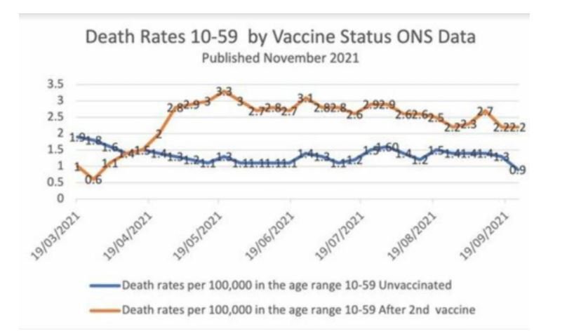
The brown line represents weekly deaths from all causes of vaccinated people aged 10-59, per 100,000 people.
The blue line represents weekly deaths from all causes of unvaccinated people per 100,000 in the same age range.
I have checked the underlying dataset myself and this graph is correct. Vaccinated people under 60 are twice as likely to die as unvaccinated people. And overall deaths in Britain are running well above normal.
Owen R. Fonorow
HeartCURE.Info CARDIO-C.COM VITC-STORE.COM
LifeWave.COM/vitamincfoundation (Partner ID 2486278)
LifeWave.COM/inteligentVitaminC (Partner ID 2533974)
HeartCURE.Info CARDIO-C.COM VITC-STORE.COM
LifeWave.COM/vitamincfoundation (Partner ID 2486278)
LifeWave.COM/inteligentVitaminC (Partner ID 2533974)
-
ofonorow
- Ascorbate Wizard

- Posts: 16184
- Joined: Tue Nov 22, 2005 3:16 pm
- Location: Lisle, IL
- Contact:
Re: 260 times more young people are dying from coronavirus vaccines than would have from coronavirus
Israeli TV Admits Vaccines Kill Via Fatal "Immune Erosion" (Video)
https://www.bitchute.com/video/OylUMXf739d8/
https://www.bitchute.com/video/OylUMXf739d8/
Owen R. Fonorow
HeartCURE.Info CARDIO-C.COM VITC-STORE.COM
LifeWave.COM/vitamincfoundation (Partner ID 2486278)
LifeWave.COM/inteligentVitaminC (Partner ID 2533974)
HeartCURE.Info CARDIO-C.COM VITC-STORE.COM
LifeWave.COM/vitamincfoundation (Partner ID 2486278)
LifeWave.COM/inteligentVitaminC (Partner ID 2533974)
-
ofonorow
- Ascorbate Wizard

- Posts: 16184
- Joined: Tue Nov 22, 2005 3:16 pm
- Location: Lisle, IL
- Contact:
Re: 260 times more young people are dying from coronavirus vaccines than would have from coronavirus
Owen R. Fonorow
HeartCURE.Info CARDIO-C.COM VITC-STORE.COM
LifeWave.COM/vitamincfoundation (Partner ID 2486278)
LifeWave.COM/inteligentVitaminC (Partner ID 2533974)
HeartCURE.Info CARDIO-C.COM VITC-STORE.COM
LifeWave.COM/vitamincfoundation (Partner ID 2486278)
LifeWave.COM/inteligentVitaminC (Partner ID 2533974)
-
ofonorow
- Ascorbate Wizard

- Posts: 16184
- Joined: Tue Nov 22, 2005 3:16 pm
- Location: Lisle, IL
- Contact:
Re: 260 times more young people are dying from coronavirus vaccines than would have from coronavirus
Owen R. Fonorow
HeartCURE.Info CARDIO-C.COM VITC-STORE.COM
LifeWave.COM/vitamincfoundation (Partner ID 2486278)
LifeWave.COM/inteligentVitaminC (Partner ID 2533974)
HeartCURE.Info CARDIO-C.COM VITC-STORE.COM
LifeWave.COM/vitamincfoundation (Partner ID 2486278)
LifeWave.COM/inteligentVitaminC (Partner ID 2533974)
-
Saw
- Ascorbate Wizard

- Posts: 2012
- Joined: Wed Jun 02, 2010 2:07 pm
- Contact:
Re: 260 times more young people are dying from coronavirus vaccines than would have from coronavirus
Even a Blind Squirrel makes his own vitamin C.
-
ofonorow
- Ascorbate Wizard

- Posts: 16184
- Joined: Tue Nov 22, 2005 3:16 pm
- Location: Lisle, IL
- Contact:
Re: 260 times more young people are dying from coronavirus vaccines than would have from coronavirus
Owen R. Fonorow
HeartCURE.Info CARDIO-C.COM VITC-STORE.COM
LifeWave.COM/vitamincfoundation (Partner ID 2486278)
LifeWave.COM/inteligentVitaminC (Partner ID 2533974)
HeartCURE.Info CARDIO-C.COM VITC-STORE.COM
LifeWave.COM/vitamincfoundation (Partner ID 2486278)
LifeWave.COM/inteligentVitaminC (Partner ID 2533974)
-
ofonorow
- Ascorbate Wizard

- Posts: 16184
- Joined: Tue Nov 22, 2005 3:16 pm
- Location: Lisle, IL
- Contact:
Re: 260 times more young people are dying from coronavirus vaccines than would have from coronavirus
Owen R. Fonorow
HeartCURE.Info CARDIO-C.COM VITC-STORE.COM
LifeWave.COM/vitamincfoundation (Partner ID 2486278)
LifeWave.COM/inteligentVitaminC (Partner ID 2533974)
HeartCURE.Info CARDIO-C.COM VITC-STORE.COM
LifeWave.COM/vitamincfoundation (Partner ID 2486278)
LifeWave.COM/inteligentVitaminC (Partner ID 2533974)
-
Saw
- Ascorbate Wizard

- Posts: 2012
- Joined: Wed Jun 02, 2010 2:07 pm
- Contact:
Re: 260 times more young people are dying from coronavirus vaccines than would have from coronavirus
Even a Blind Squirrel makes his own vitamin C.
-
ofonorow
- Ascorbate Wizard

- Posts: 16184
- Joined: Tue Nov 22, 2005 3:16 pm
- Location: Lisle, IL
- Contact:
Re: 260 times more young people are dying from coronavirus vaccines than would have from coronavirus
Owen R. Fonorow
HeartCURE.Info CARDIO-C.COM VITC-STORE.COM
LifeWave.COM/vitamincfoundation (Partner ID 2486278)
LifeWave.COM/inteligentVitaminC (Partner ID 2533974)
HeartCURE.Info CARDIO-C.COM VITC-STORE.COM
LifeWave.COM/vitamincfoundation (Partner ID 2486278)
LifeWave.COM/inteligentVitaminC (Partner ID 2533974)
-
ofonorow
- Ascorbate Wizard

- Posts: 16184
- Joined: Tue Nov 22, 2005 3:16 pm
- Location: Lisle, IL
- Contact:
Re: 260 times more young people are dying from coronavirus vaccines than would have from coronavirus
Owen R. Fonorow
HeartCURE.Info CARDIO-C.COM VITC-STORE.COM
LifeWave.COM/vitamincfoundation (Partner ID 2486278)
LifeWave.COM/inteligentVitaminC (Partner ID 2533974)
HeartCURE.Info CARDIO-C.COM VITC-STORE.COM
LifeWave.COM/vitamincfoundation (Partner ID 2486278)
LifeWave.COM/inteligentVitaminC (Partner ID 2533974)
-
Saw
- Ascorbate Wizard

- Posts: 2012
- Joined: Wed Jun 02, 2010 2:07 pm
- Contact:
Re: 260 times more young people are dying from coronavirus vaccines than would have from coronavirus
Another basketball player in Spain (Oscar Cabrera) is collapsing with suspected heart attack, according to online reports


Even a Blind Squirrel makes his own vitamin C.
-
ofonorow
- Ascorbate Wizard

- Posts: 16184
- Joined: Tue Nov 22, 2005 3:16 pm
- Location: Lisle, IL
- Contact:
Re: 260 times more young people are dying from coronavirus vaccines than would have from coronavirus
Owen R. Fonorow
HeartCURE.Info CARDIO-C.COM VITC-STORE.COM
LifeWave.COM/vitamincfoundation (Partner ID 2486278)
LifeWave.COM/inteligentVitaminC (Partner ID 2533974)
HeartCURE.Info CARDIO-C.COM VITC-STORE.COM
LifeWave.COM/vitamincfoundation (Partner ID 2486278)
LifeWave.COM/inteligentVitaminC (Partner ID 2533974)
-
Saw
- Ascorbate Wizard

- Posts: 2012
- Joined: Wed Jun 02, 2010 2:07 pm
- Contact:
Re: 260 times more young people are dying from coronavirus vaccines than would have from coronavirus
The Depopulation Continues For All Those Who Still Trust Govt, Doctors & TV
The vaccinologist Dr.Bridle also cites 5 studies that agree with the 5:1 number Steve Kirsch is using here.

The vaccinologist Dr.Bridle also cites 5 studies that agree with the 5:1 number Steve Kirsch is using here.

Even a Blind Squirrel makes his own vitamin C.
Return to “Vitamin C and Infections: e.g. Covid, Spike Protein, Vaccination”
Who is online
Users browsing this forum: No registered users and 0 guests

